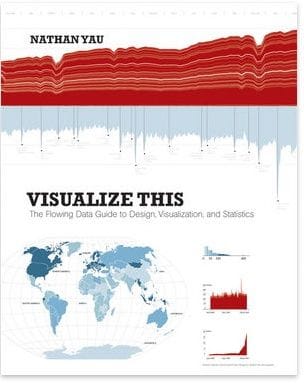
In July Wiley published the book Visualize This – The Flowing Data Guide to Design, Visualization and Statistics. The book is written by Nathan Yau, and he is of course also behind the popular FlowingData blog about the same topic. This is a short review of the book.
Please keep in mind that I’m no expert in data visualization. The book is written for people like me, an expert in the topic will probably look at the book differently.
And the book is intended as an introduction to important concepts. It is probably the wrong book if you are interested in using a particular tool – e.g. Adobe Illustrator, R or Flash – for Data Visualization.
The examples in the book are about topics similar to those used in the FlowingData blog, most of them are about data journalism. This is not a book about visualization of scientific experiments.
The first chapter of the book talks about how to tell stories with data. This is a very important chapter, as learning how to tell a good story is more important than knowing all the details on how to use a tool for visualization.
Nathan continues with a chapter on how to find and format data for data visualization. We are then introduced to a number of important visualization tools, and their particular strengths. Nathan uses a large number of tools in the book, but seems to particularly like Python for formatting data, R for for calculation and visualization, and Adobe Illustrator for perfecting the result for publication. This is one of the take-home messages of the book for me: instead of perfecting the use of one particular tool, learn to decide what works best for a particular problem. R and Illustrator are a good start for most problems.
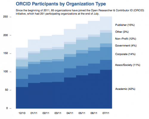
The next few chapters look at visualizations in different contexts: patterns over time, proportions, relationships, differences and spatial relationships. All chapters are written with examples that you can follow along, and with enough basic information that you can start solving similar problems on your own. Below is a chart I tried myself after reading the book. It looks at the number of member organizations of the non-profit ORCID over time (more info here).

I can highly recommend Visualize This to anybody interested in learning about data visualization. I found only two things I didn’t like. I wish Nathan had spent more time explaining how a data graph can be improved visually. In many examples he shows how small changes in color or font size can make a big difference in presentation, but I would prefer to see a more systematic approach to this important topic. I wouldn’t mind if he would drop the chapter on Chernoff faces instead – fun stuff, but not really important in an introductory text.
My other problem is with the publisher. I read the book as ePub on my iPad. It is nice to have web links you can click in the text, but it would have been even nicer if the ePub had ben prepared with a little bit more care. Most images in the text (there are many) are too small – in an ePub you expect figures to enlarge and show more detail when you click on them. And figure headings were regularly orphaned (on a different page than the figure itself). ePub is an evolving standard, but a little bit of consideration for typography and layout would go a long way.


