PLOS Article-Level Metrics (ALM) are a great set of data (available via API and as monthly data dump) for some nice data visualizations. I have recently become a big fan of the d3.js javascript library, and have now used d3 to look at some ALM data over time.
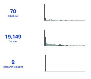
I like simple visualizations without too many labels or axes, and wanted to do a visualization inspired by sparklines ever since we discussed this idea in our altviz breakout group at the ALM workshop hackathon in November 2012 (kudos in particular to Juan Alperin, Karthik Ram and Carl Boettiger). In the chart below every column represents the numbers for a given month, with alternating colors for the years (the article was published November 2009).

You can see a pattern that is probably typical for many articles independent of the absolute numbers: most pageviews and downloads happen in the weeks after publication, as does academic bookmarking and science blogging.
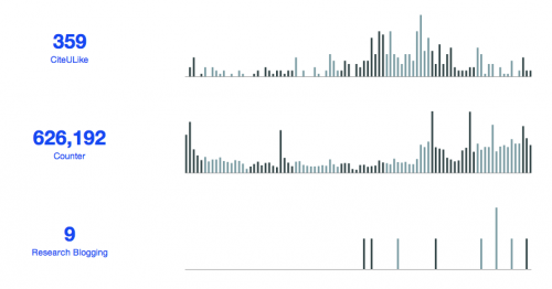
The second example shows a very different pattern. This is not only the most-downloaded PLOS article, but the distribution of downloads over time is very different, with the number of monthly downloads actually higher the last two years (this article was published in August 2005). We also see a few spikes in the usage stats, probably indicating events that triggered usage. Academic bookmarking was most active from 2009 to 2011 and not right after publication, although that might also have to do with the relative popularity of CiteULike over time.
Citation data are unfortunately more difficult to get with exact publication dates (why is that so difficult?), but we can at least look at CrossRef numbers by year for the same article.
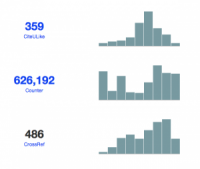
The citation numbers by year are still increasing (the last bar is for 2013), indicating that this article is still of general interest 8 years after publication. This would probably be unusual for a life sciences research article, but the article is an essay looking at common pitfalls in the statistical analysis of research data.
