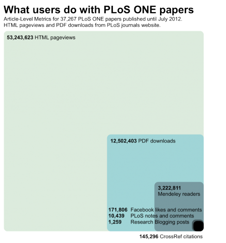
Inspired by four recent blog posts and their comments (Comments at journal websites: just turn them off, Open Access and The Dramatic Growth of PLoS ONE, No Comment?, If you email it, they will comment), I created a graphic to show what users do with PLoS ONE papers. As always, the data behind the graphic are openly available. I think that the number of times a paper is informally discussed (comments, Facebook, science blogs, etc.) should be much larger compared to the number of formal citations. The challenge is of course to have technology that captures all these discussions – this is much more difficult than for bookmarks or citations, and is obviously what altmetrics is all about. The blog posts I link to above also express another feeling: that there are still too many barriers for scientists to take part in the informal discussion of scholarly research on the web, in particular as comments on journal websites. Hat tip to David McCandless for inspiration.
Update 08/02/12: The publication of the dataset used in this chart was delayed, but the data are now available at the link provided.


